Veera
Foundation
BRAND STRATEGY
BRAND IDENTITY
VISUAL COMMUNICATION
WITH PRAXIS ARTS
A transformative movement dedicated to reshaping traditional male-centric social norms by nurturing a generation of male allies who actively engage in meaningful dialogue to understand their role in creating a safer, more equitable society for women.
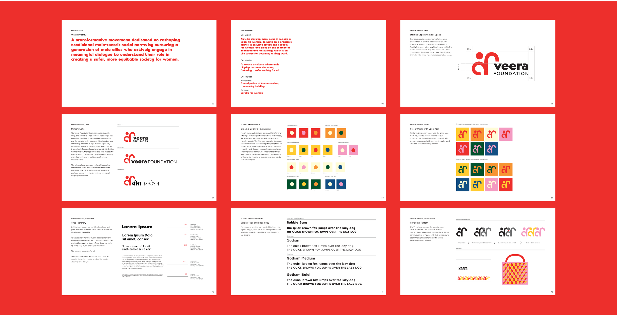
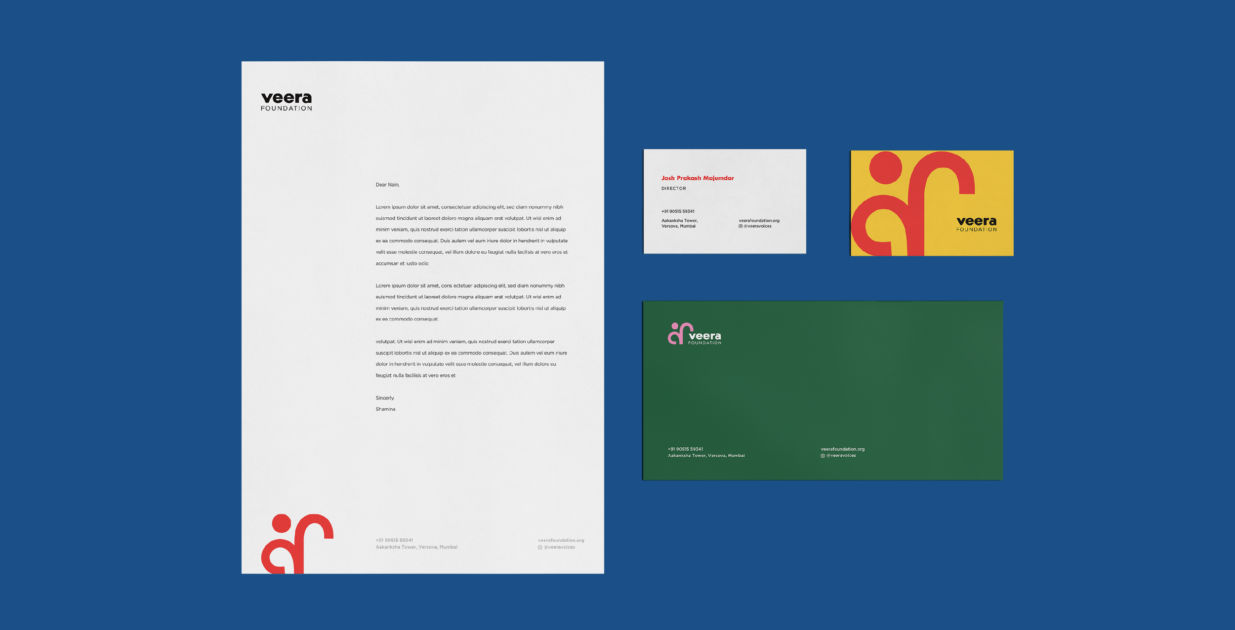
For the brand, I developed the complete identity system, brand strategy, communication framework, and guidelines.
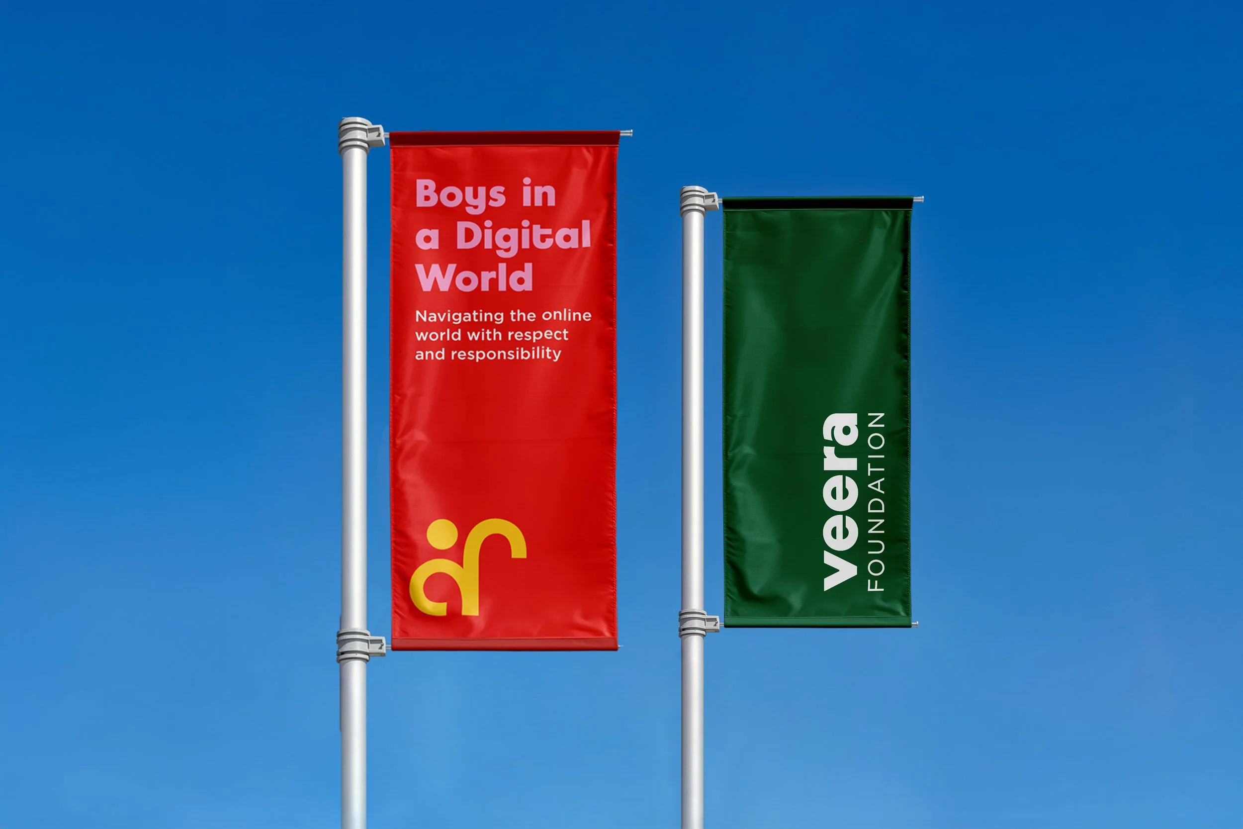
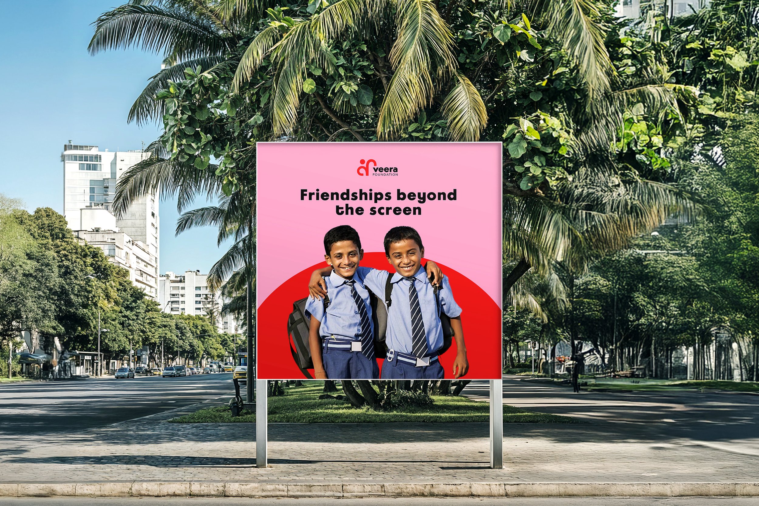
The visual and verbal language was designed to balance warmth with credibility creating a brand that feels approachable, thoughtful, and impactful while supporting meaningful dialogue and long-term cultural change.
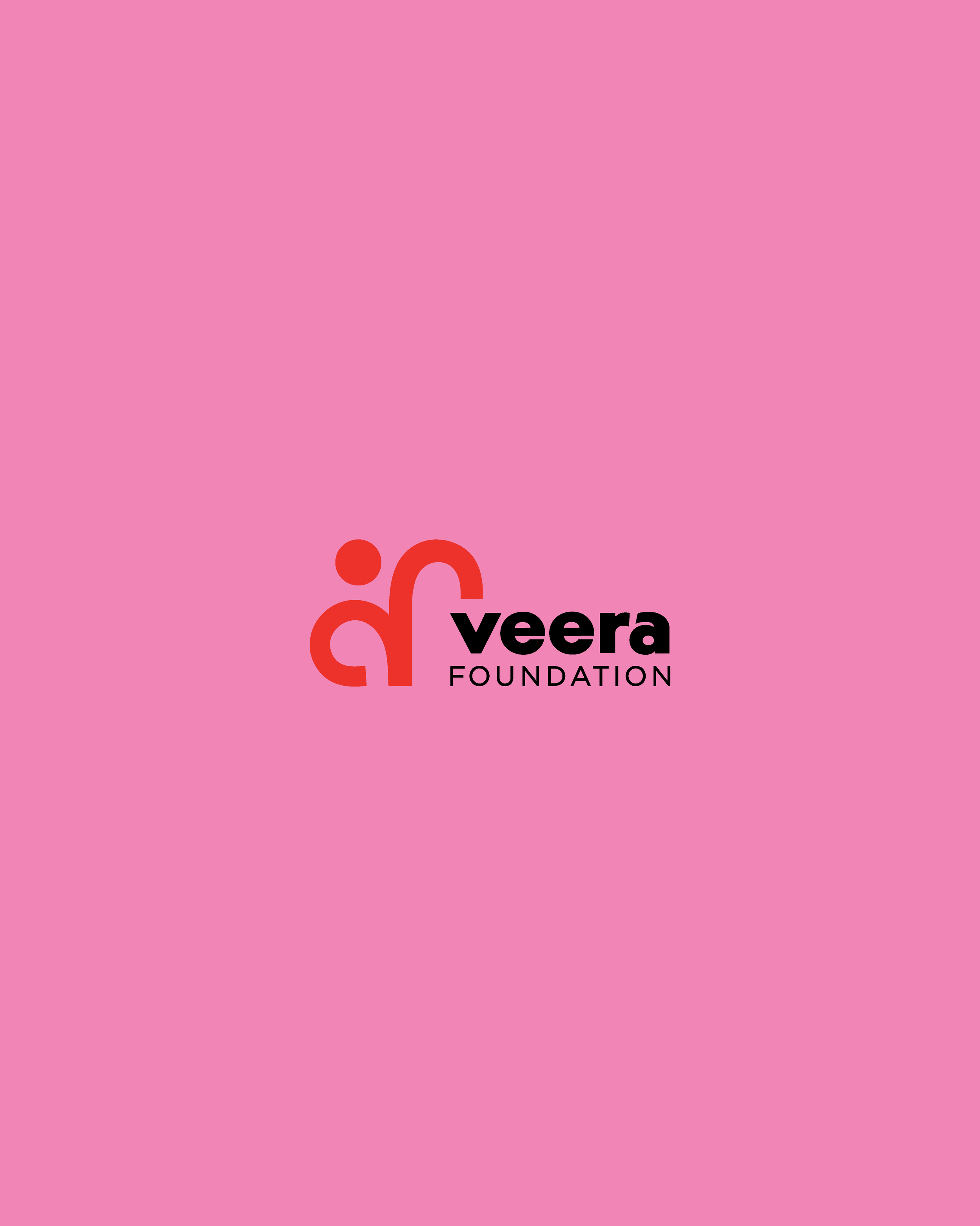
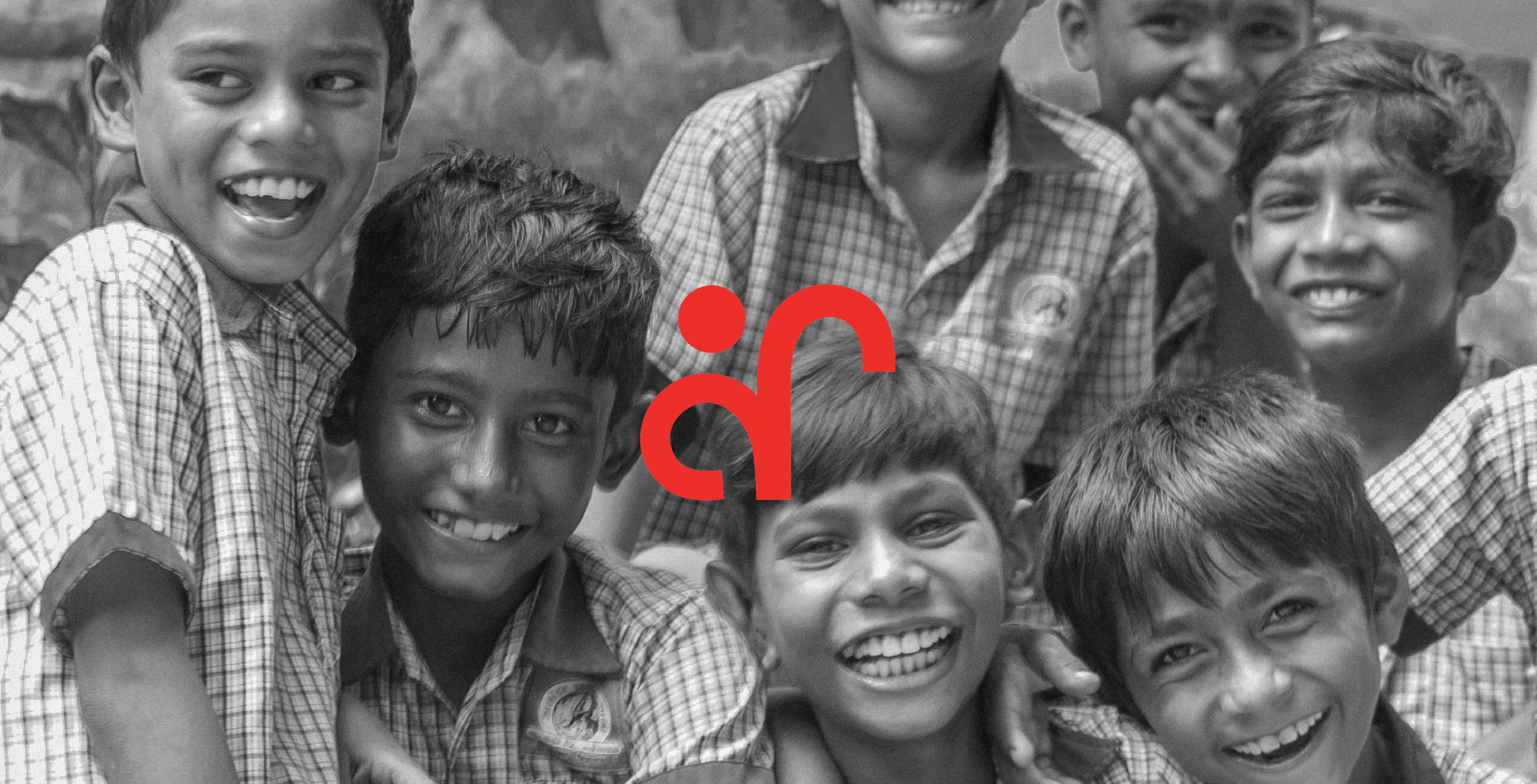
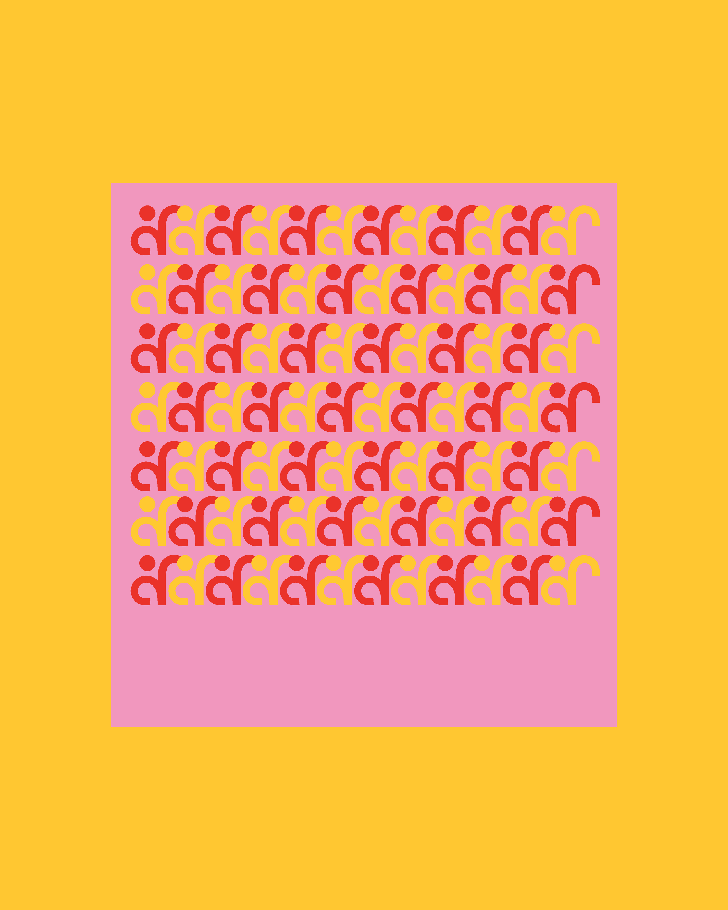
The Veera Foundation logo represents strength, unity, and collective empowerment. Featuring a bold figure in a confident pose, it symbolizes resilience and the transformative power of rising together as a community. The form of logo mark is inspired by Devanagari and other Indian scripts, subtly rooting the design in South Asian cultural identity. Reflecting Veera’s mission, the logo serves as a bold mascot for change, embodying hope, transformation, and the shared commitment to building a safer, more inclusive world.
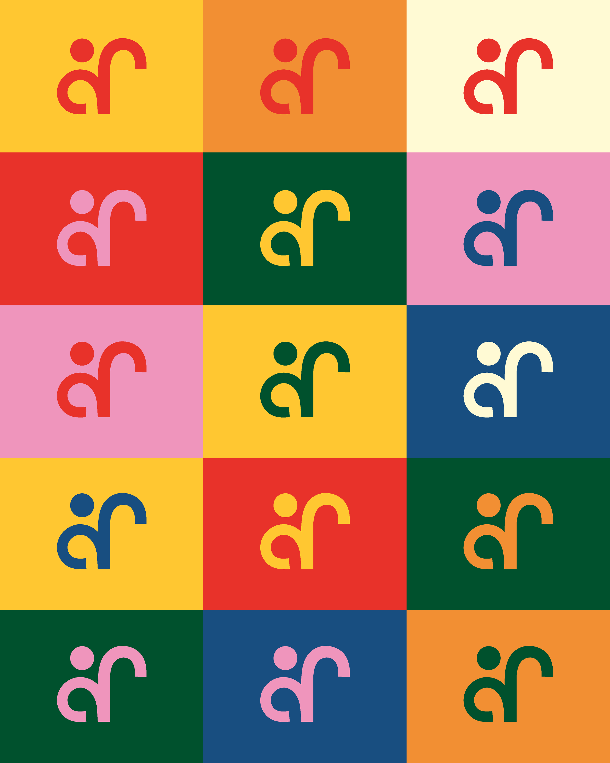
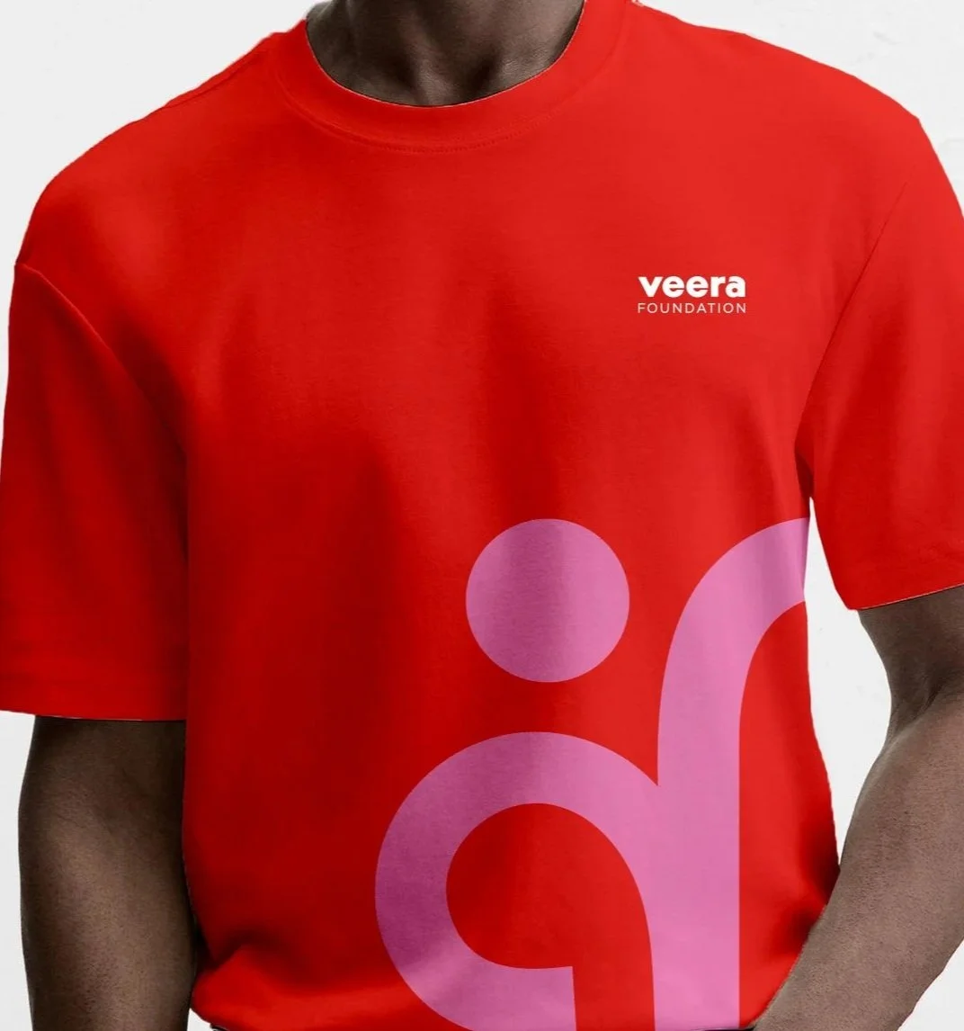
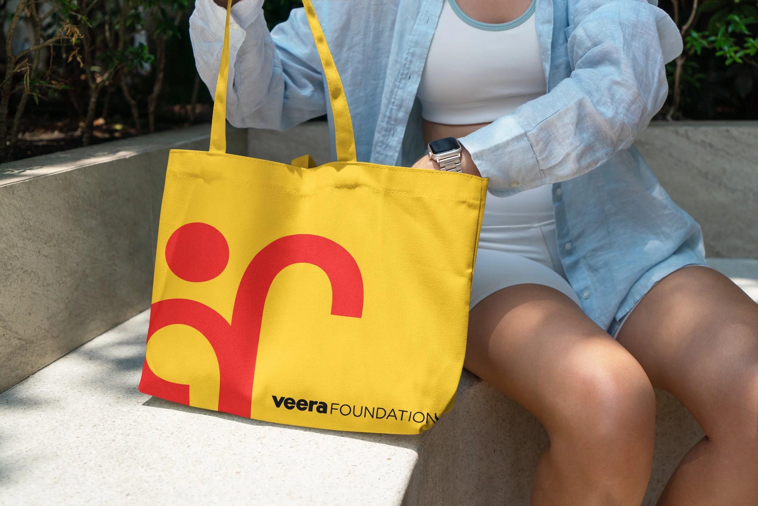
The logo mark is designed to stand independently as a bold symbol of Veera Foundation’s mission. Its dynamic humanoid form ensures versatility, allowing it to be used without the word mark in contexts where a simplified, impactful representation is needed. This flexibility makes the logo mark instantly recognisable and adaptable across various applications while maintaining its strong visual identity.